As BetterMe expanded its wellness offering, the brand needed to evolve with it. Working alongside Instrument, I helped establish a more cohesive visual language and flexible design foundation that could support BetterMe across product, marketing, and brand experiences. The work spanned key web experiences, a reusable system of components and visual patterns, responsive behavior, motion, and contributions to the mobile app, creating greater consistency while leaving room for the brand to continue evolving.
BETTERME
Wellness
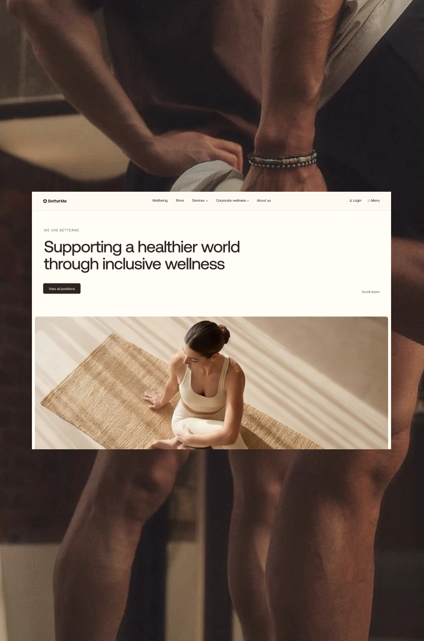
Betterme Wellness
Partnered with Instrument and BetterMe to evolve a growing wellness ecosystem spanning product, marketing, and brand experiences across web and mobile.
ROLE
Senior Product Designer
Scale
10M+ MONTHLY ACTIVE USERS WORLDWIDE
Timeline
12 weeks
Platforms
Web, Mobile
Focus
Design Systems, Brand Experience, Acquisition & Conversion
Team
Instrument Design Team, BetterMe Product & Marketing Stakeholders
Responsibilities
Strategy, Systems, Branding, Conversion, UI
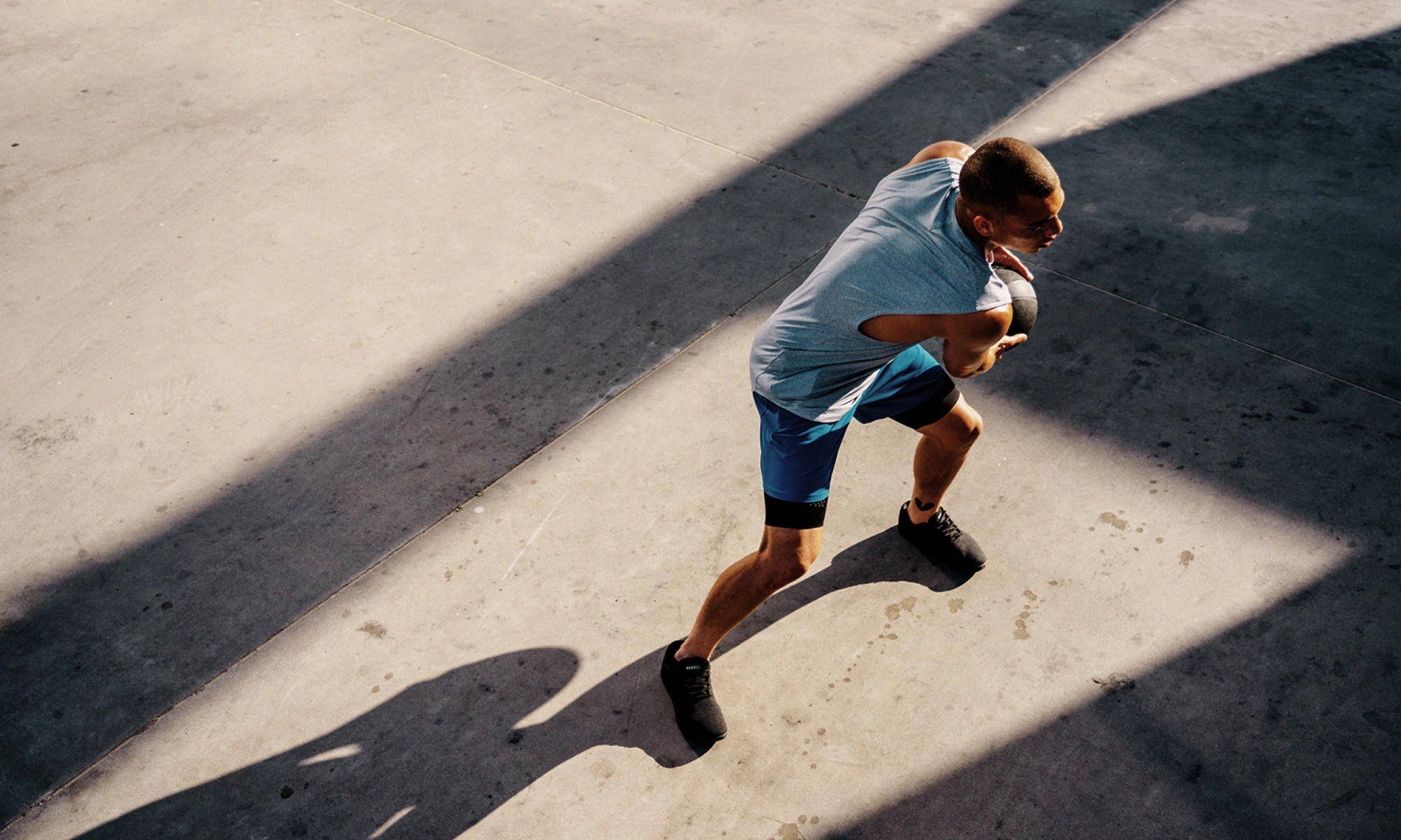
FROM BRAND TO SYSTEM
BetterMe was evolving into a broader wellness brand, and its digital presence needed the structure to support that shift. We translated the brand into a cohesive visual system designed to work consistently across existing and future experiences.
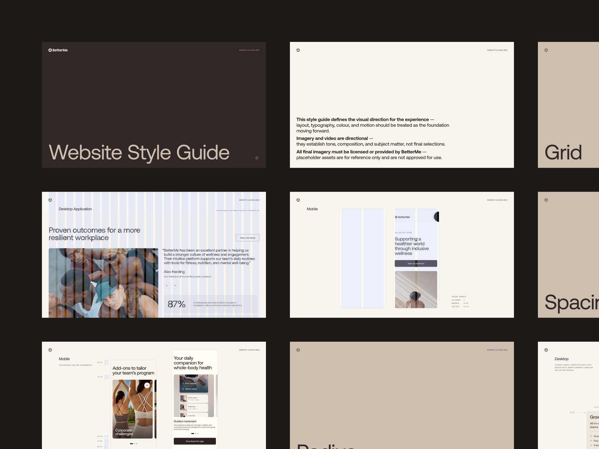
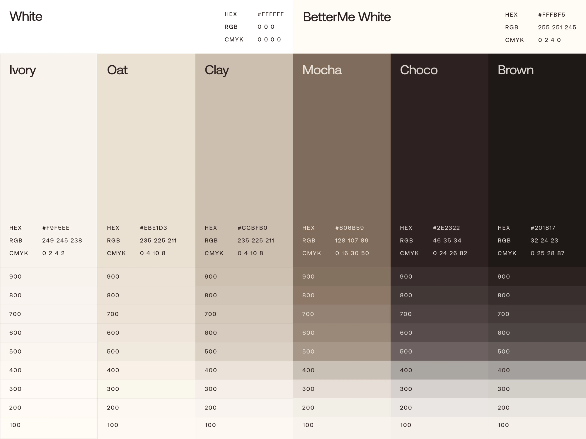
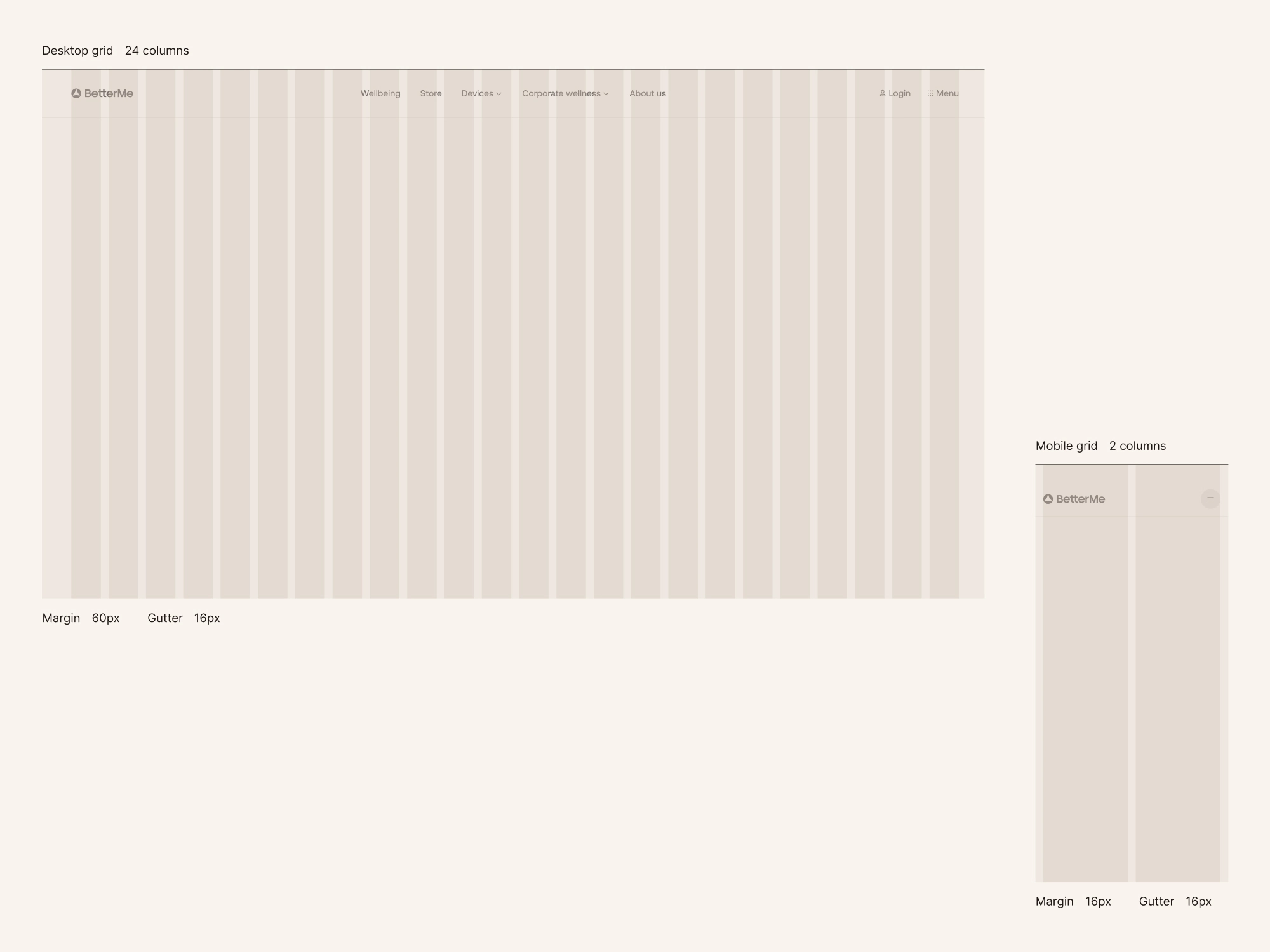
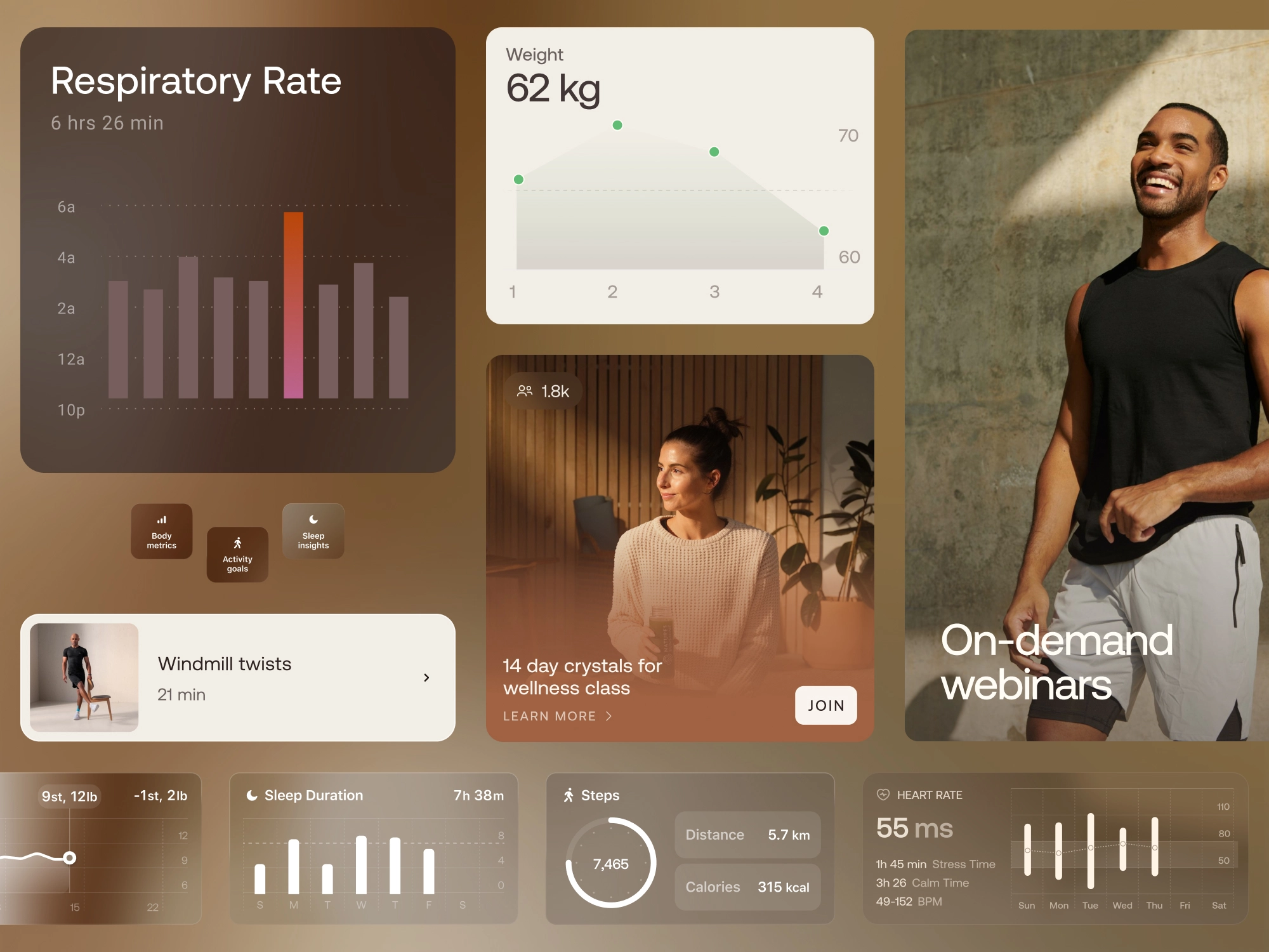
A FOUNDATION FOR WHAT CAME NEXT
We defined the core elements of BetterMe’s digital visual language across color, typography, layout, buttons, page heroes, and reusable UI elements. Together, they gave the brand a more cohesive foundation that could extend across new pages and experiences while leaving room for its digital presence to continue evolving.
Core experiences
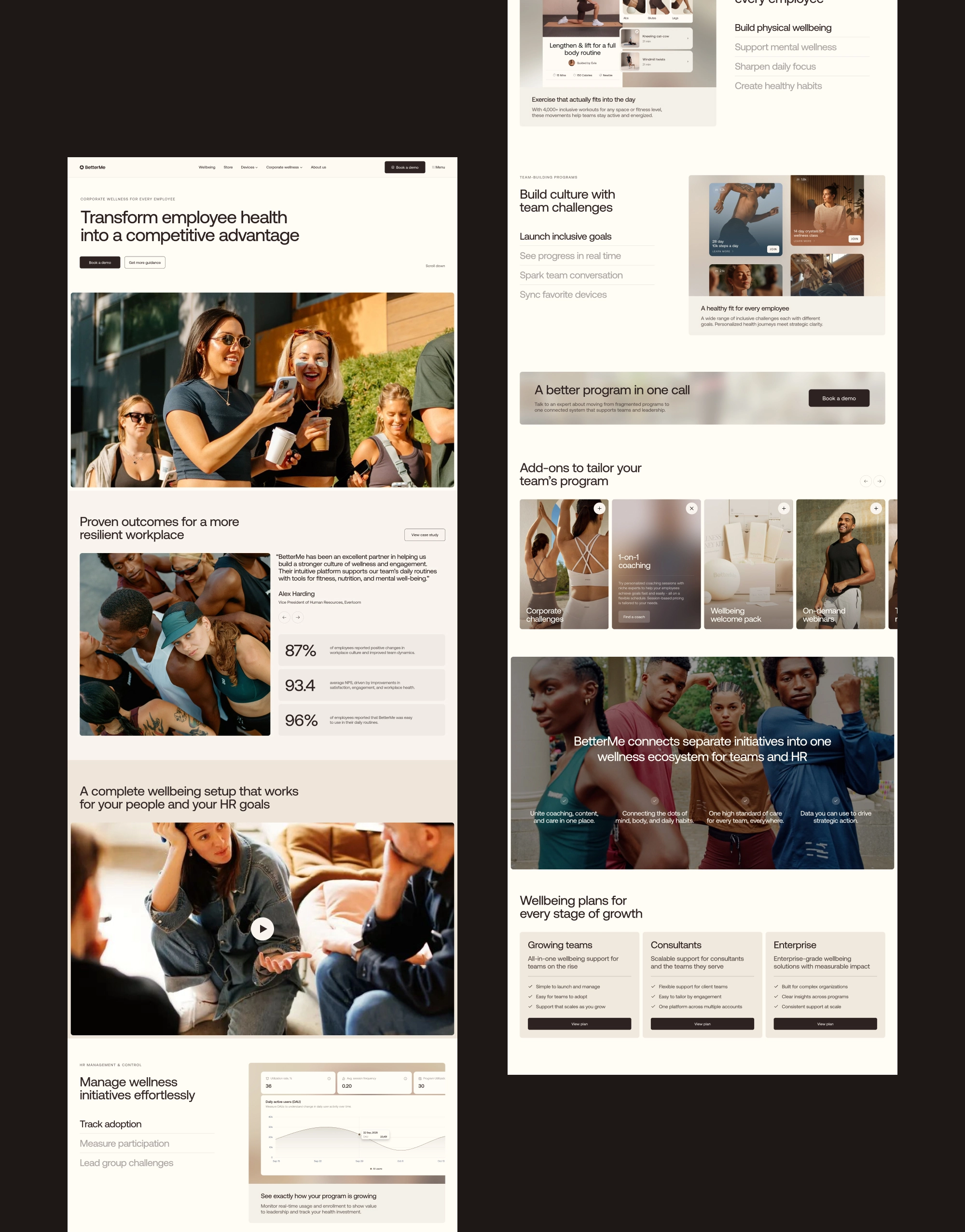
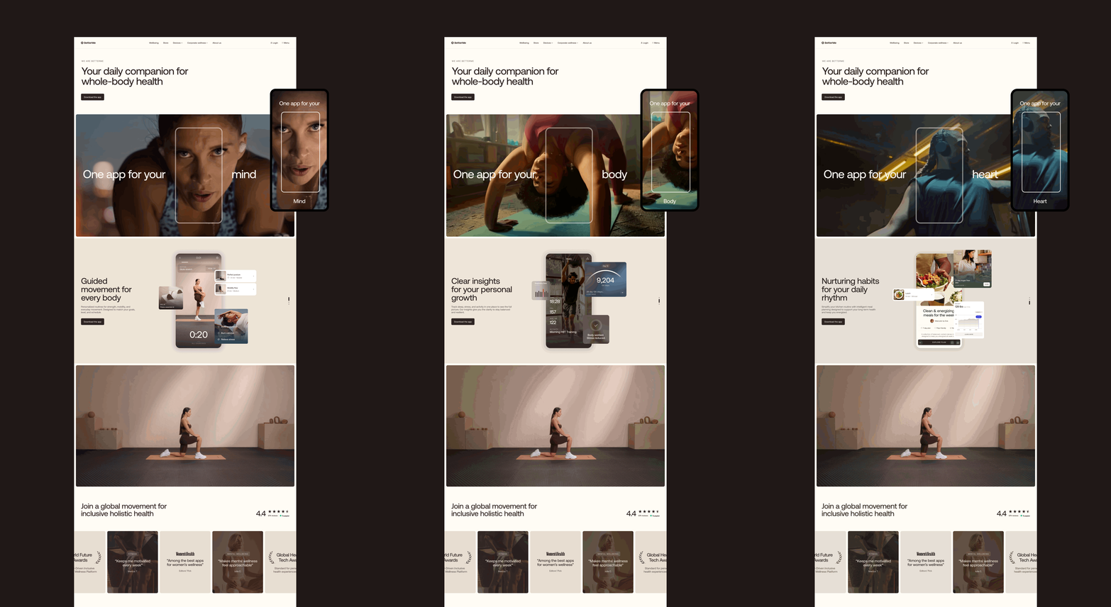
One system had to serve many different jobs. Across product, brand, corporate wellness, and careers, we shaped experiences around what each audience came to BetterMe to understand, explore, and do.
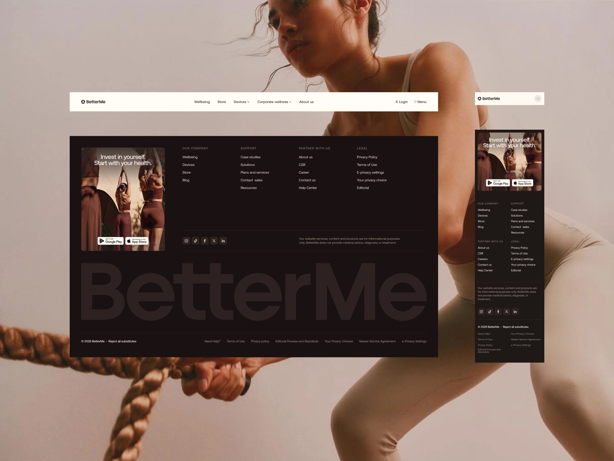
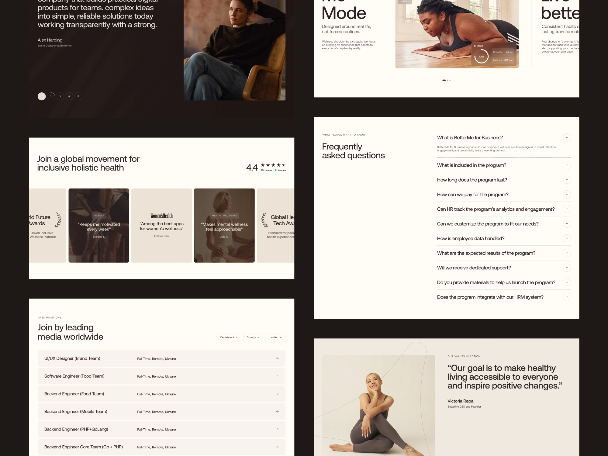
CONSISTENT IN LANGUAGE, DIFFERENT IN PURPOSE
Each experience started with a distinct user need and business goal. The consumer experience introduced BetterMe’s broader product ecosystem and guided people toward the app, while corporate wellness spoke to organizations, About built familiarity and trust, and Careers supported prospective candidates. A shared navigation connected these experiences, making the growing ecosystem easier to understand and move through.
BRINGING THE EXPERIENCE TO LIFE
A little movement went a long way, bringing personality, surprise, and delight to moments throughout the experience.
ADDING DELIGHT WITHOUT GETTING IN THE WAY
We focused motion on moments where it could add something meaningful to the experience. An interactive timeline brought BetterMe’s history to life, scroll-based reveals created a sense of pacing through longer stories, and a cinematic landing animation introduced the app with more energy and visual impact.
DESIGNED FOR EVERY SCREEN
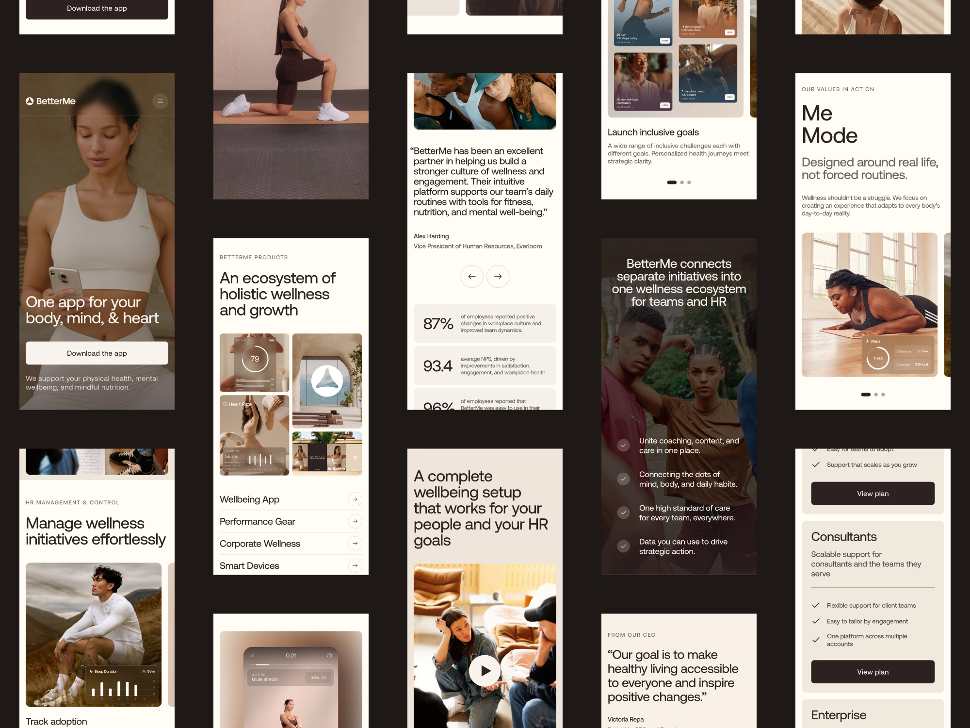
The experience was designed to feel just as considered on a phone as it did on a larger screen, adapting the same visual language for mobile without losing what made the experience feel distinctly BetterMe.
MORE THAN SHRINKING THINGS DOWN
Bringing the experience to smaller screens meant reconsidering what to keep prominent, what to simplify, and how content should flow. We reprioritized content and reworked layouts, imagery, and interactions so mobile felt considered in its own right rather than simply a scaled-down version of desktop.
Mobile app
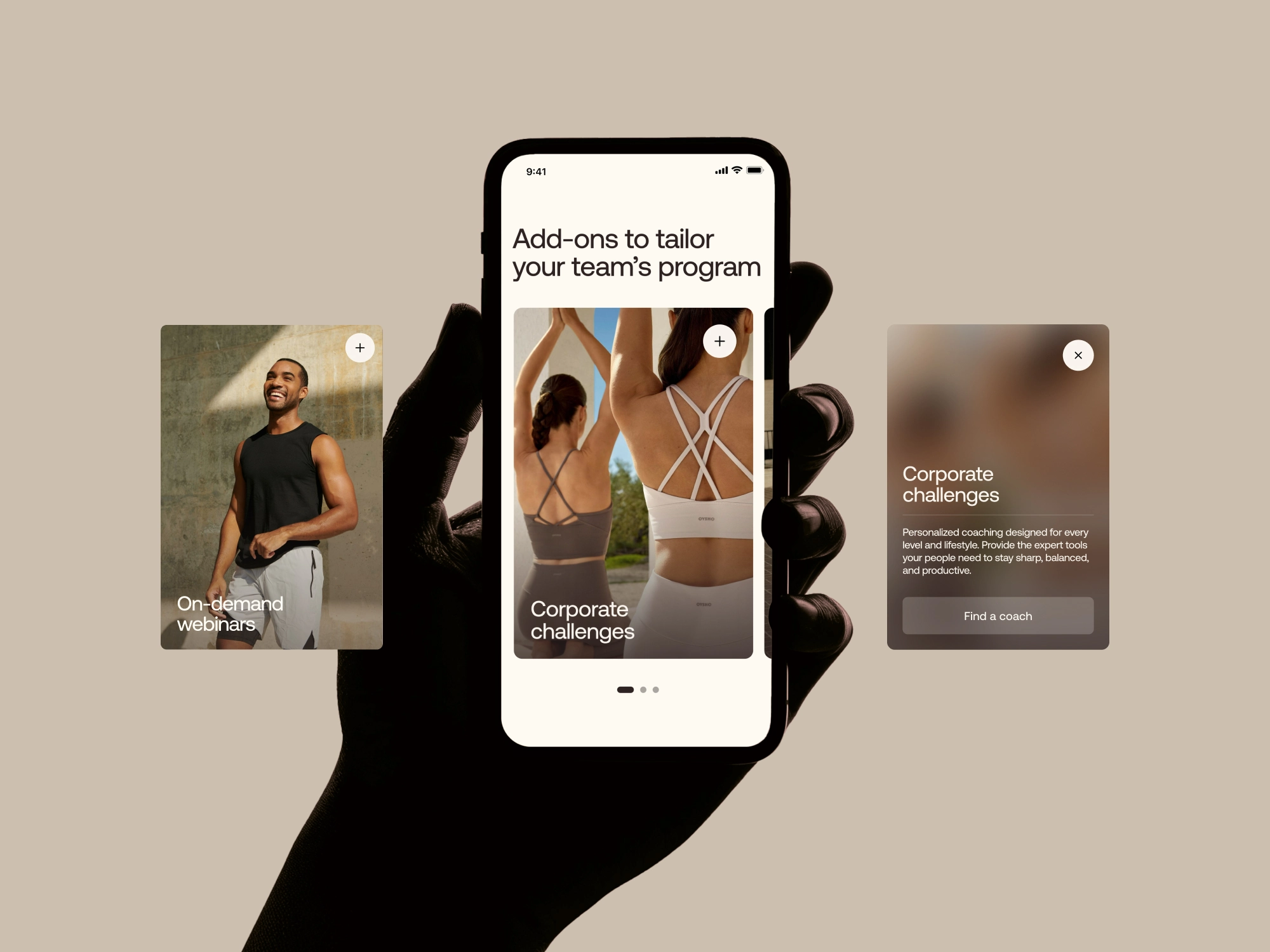
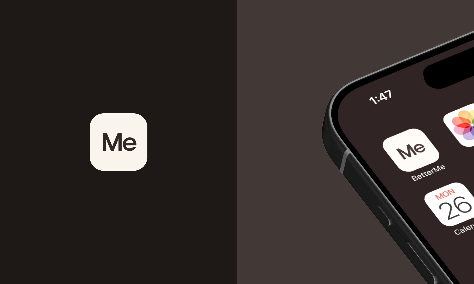
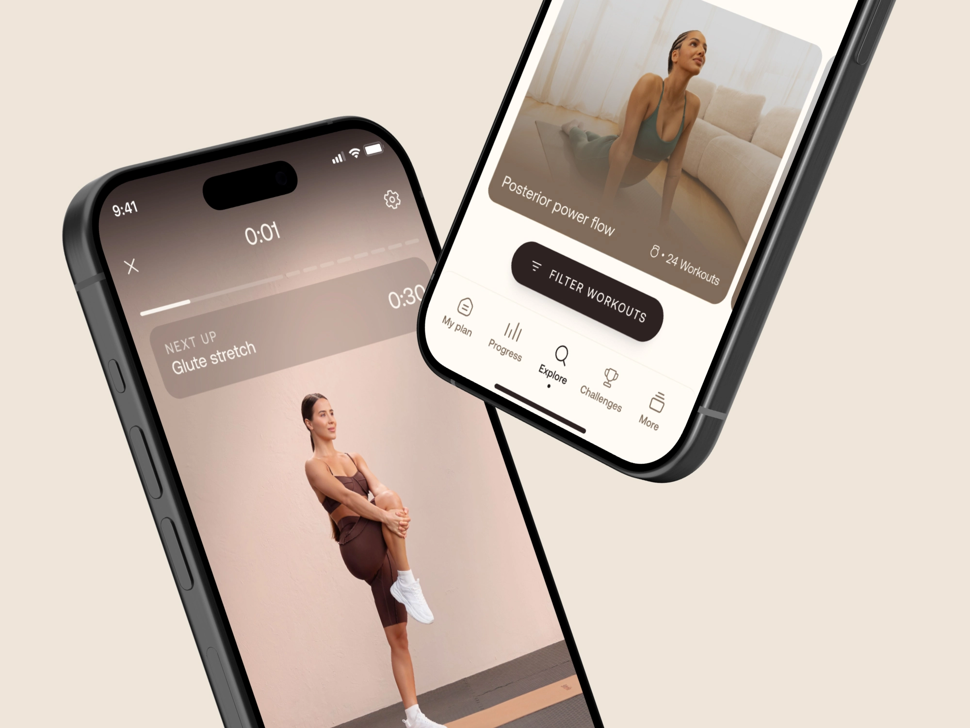
The visual language extended into the BetterMe app, bringing the same warmth and clarity to a more product-focused experience.
EXTENDING THE SYSTEM INTO PRODUCT
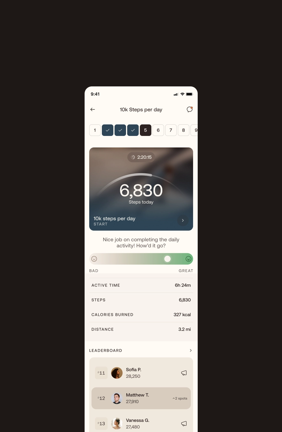
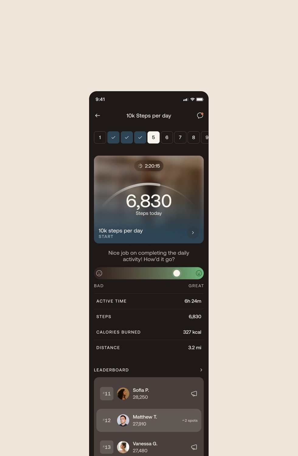
Instrument extended the redesign into BetterMe’s core product experiences, carrying the same visual language from web into the app. I contributed to this evolution through selected product experiences and the development of light and dark modes, helping ensure the new visual direction remained cohesive and distinctly BetterMe across both themes.
Reflection
BetterMe reinforced the value of building a strong visual foundation for a brand that was continuing to evolve. The goal wasn’t to make every experience look the same, but to create a shared visual language that could bring greater consistency to the brand while giving BetterMe room to grow and elevate its presence across different products and audiences. Working alongside Instrument’s team in a fast-paced agency environment also meant collaborating closely across disciplines, building on each other’s work, and moving quickly while maintaining a high level of craft. The result gave BetterMe a stronger foundation to continue building from as the brand evolved.
Appfolio
Web